Art Deco and Beyond: An Architectural Tour of New York City
The New York City skyline we know well today was not always so recognizable. While the skyline wasn't uniform in the early to mid 1800s, it was considerably shorter. Prior to the rise of the skyscraper, buildings in New York were mostly made of wood. Brownstone and brick were popular in Federal and Greek Revivalist architecture, but the weight of these materials limited the buildings' height to between four and five stories. Many of these buildings are standing in New York City to this day. Famous structures predating the skyscraper boom in the late 1800s include the Federal Hall National Memorial, Trinity Church and Bethesda Terrace among many others. As innovations in building allowed for taller and more varied styles, the skyline rose and changed to become what it is today.
Early Skyscrapers: 1884-1920


The skyscraper's invention came at a time when American cities were growing rapidly. There was little room for cities to expand outward, so architects began looking upward as a solution. Two things made the invention of the skyscraper possible: the invention of technologies such as the Bessemer steel process in 1855 and the hydraulic elevator in 1870 and the ingenuity of architects who created innovative designs for taller, steel-frame structures. While not tall by today's standards, early skyscrapers were a leap forward from stone buildings limited to five stories due to their load-bearing capabilities.
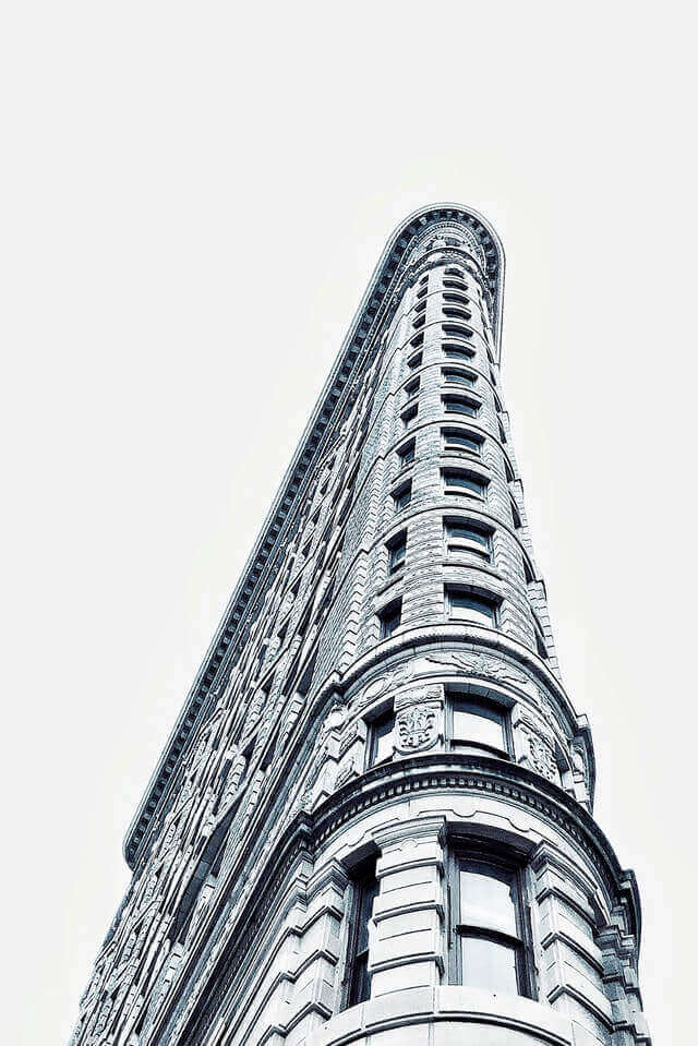
Examples of early New York City skyscrapers that exist today include the Temple Court Building and Annex (Silliman and Farnsworth, 1881), the impressive 60-story Woolworth Building (Cass Gilbert, 1913) and the iconic Flatiron Building (Daniel Burnham, 1902).
Beaux Arts: 1890-1920


Beaux Arts, named for l'Ecole des Beaux Arts in Paris, translates to "fine arts" in English. Beaux Arts as an architectural style belonged to Classicism and focused on columns, lightly colored and symmetrical facades, embellishment in the Greco-Roman style, and limestone. The start of the Beaux Arts movement in America can be traced to several architects who attended the Paris academy: Richard Morris Hunt (the first American attendee and later the co-founder of the American Institute of Architects), Henry Hobson Richardson, and Charles McKim. The style was further spread by its use at the 1893 World's Columbian Exposition in Chicago.
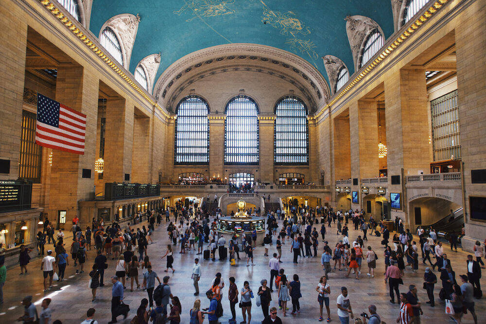
Some prominent examples of the Beaux Arts style in New York City include the New York Public Library (John Carrère and Thomas Hastings, 1911), Grand Central Terminal (Charles Reed, Allen Stem, Whitney Warren, and Charles Wetmore, 1903-13), and the Brooklyn Museum (McKim, William Mead, and Stanford White, 1895).
International Style: 1914-70
International style was greatly influenced by the disillusionment following World War I. Mass production also played a role: Cities were expanding at a rate that did not support the length of time required to ornament every office or apartment building. This can be seen in the architectural shift from the celebration and ornamentation of the Beaux Arts period to the functionality of the International style. That isn't to say that there wasn't elegance in functionality. This was accomplished with exposed glass and steel, rectangles, interior openness, and an overall sleek appearance.
The American International style took inspiration from German architects Walter Gropius and Ludwig Mies van der Rohe. The term "International style" came from a 1932 Museum of Modern Art exhibit curated by Henry-Russell Hitchcock and Philip Johnson.
The Starrett-Lehigh Building (R.G. & W.M. Corey, 1931) and the Film Guild Cinema on 8th Street (Frederick Kiesler, 1931) were featured in the 1932 MoMA exhibit. The Seagram Building (Mies van der Rohe, 1958) is another example of a New York City building constructed in the International style.
Art Deco: 1925-40
The name of this architectural and artistic style came from the Exposition Internationale des Arts Decoratifs held in Paris in 1925. The style included much embellishment, with crisp lines, geometric shapes, and bold patterns beginning to work their way into building designs. Materials used included stucco, terra-cotta, and concrete. While the designs were meant to be unique and visually arresting, they were sometimes purchased in mass-produced forms, hinting at the continued trend of practicality and convenience and raising the question of how unique modern trends could truly be.
Some of the most recognizable examples of Art Deco architecture in New York City come in the sharply set lines of skyscrapers: the famous Empire State Building (William F. Lamb, 1931), the Chrysler Building (William Van Alen, 1930), and the impressive sprawl of Rockefeller Center (Raymond Hood, 1932-40).
Postmodern: 1975-90
Postmodernism in the 1970s reflected a newfound whimsy following a period of functionality defined by the International style. It was a reaction to modernism but also a return to classic architecture, which is seen in its use of the column as an aesthetic feature. A variety of building materials were used to create texture, while several different architectural styles were often combined in an attempt to breathe life into buildings drowning in their own practicality.
Examples of Postmodern buildings in New York City include the Sony Tower (Philip Johnson and John Burgee, 1984) with its keyhole roofline, the "Lipstick Building" on 3rd Avenue (Johnson and Burgee, 1986) nicknamed for its tubular shape, and the AXA Equitable Center (Edward Larrabee Barnes, 1985), complete with geometric patterns.
21st Century Architecture


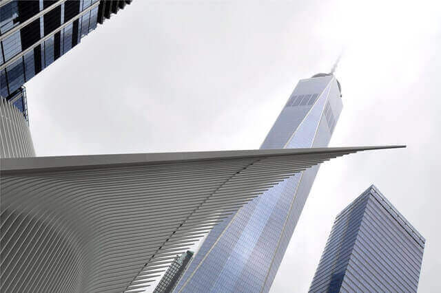
21st century architecture has so far varied throughout America and the world, and it will be up to future historians to decipher a specific trend. One trend surfacing in New York City in the 2000s, however, has been textured architecture and the mixing of past architectural styles. The Jenga-like design of 56 Leonard St. is a perfect example of the textured approach. One World Trade Center is an example of mixing advancing designs of the 21st century with inspiration and authenticity from the past. The opening of One World Trade Center (Daniel Libeskind, 2014) was highly anticipated, and its height is accented by its smooth, geometric design. But renovation and innovation continues throughout New York at all times, and it will be up to the next generation to decide which style comes next.


